

Branding, UI/UX
Hab’eat sought to be a disruptive habit-forming, dietary tracker app. Seeking to build lasting change to dietary intervention. To solve short lived diet fads and build long term habitual change and life-long lasting improvements.
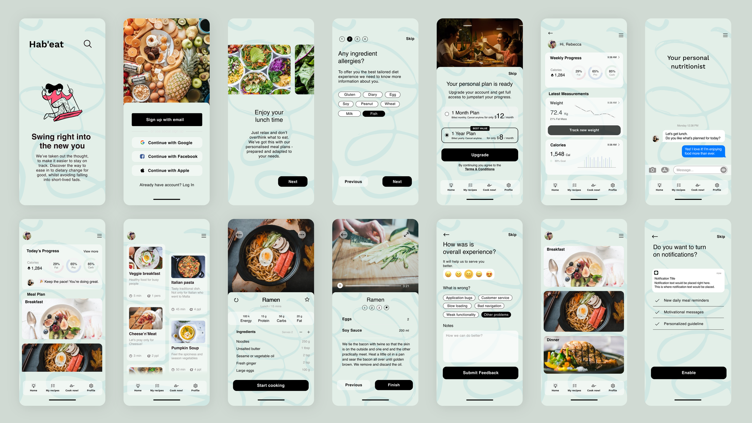
Hab’eat’s look and initial direction was born through cross-ideation with the internal team, who were seeking a more customisable diet-app experience. I expanded upon this existing concept via research by creating concepts that married ideal dietary goals, with reality. Using this research we formed updated user-flow concepts and applied them to the human experience that lies outside of the dietary apps.
Hab’eat
The problem
A look at user habits regarding typical diet fads and dietary apps and we quickly discovered user pain points that brought about the typical eventual decline in daily active use. It turned out motivation loss, understandably, tended to stem from real-life dietary commitment failures (such as social events, meals out, parties, limited time, etc.).

Solution
As a response to user surveying, I sought to include cheat days, eating out and take away accommodation. To facilitate real world dieting. Resulting in a lessening of the feelings of failure and allowing users to remain on track and active through real-life events and situations.
We rolled out some initial flows as a group, narrowed down the mos concise concepts through democratic elimination, placed these into a consistent flow and created lo-fi wireframes. Once we had found the best approach we moved these along to some initial hi-fi screens. These where then pushed, tested and user feedback collected and continue to be improved upon via ongoing research.

The impact
We managed to take the app from having around 10% of daily active users 9 months after initial sign up date, up to 60% of users remaining active after 9 Months. We also took the amount of user remaining on the app at all up from 10% across the same time period up to a 75% of user remaining after 9 months.
Daily Active Users (%)
User Retention (%)
Accessibility
I believe at this point that accessible design consideration is a non-negotiable and there is no good reason to reduce potential audience. Many means to simply check are built into design software, with Android and Google, as well as Apple and others contributing many platforms across multiple stages of product creation, where by these considerations can be checked and aligned to ensure the broadest possible access.
For the Hab’eat app, we used a series of interventions; in app plugins in Figma for legibility, colour, contrast and sizing of elements to ensure we met the bar. As well as taking time to review the WCAG guidelines and Google Pre-launch reports.

This is one of the tools we use to assess colour contrast within screens. Good colour contrast assists people with vision impairment, including colour blindness, and cognitive impairments when viewing content

An example of a tool to dictate object focus order in browser, Keyboard and screen reader users depend on the focus order provided by the content. For example, navigating a form can be disorientating if the sequence jumps between unrelated elements.This allows us to manually label proposed order for clear interpretation in
development stages.
