
Butterfly Conservation
Branding, UI/UX, Graphic Design, Product Management
Butterfly Conservation had experienced quicker growth than planned for and given time, inconsistencies had arisen across the brand along with a need for a refreshed direction, with the app solely operating as a survey.
I initially started by breaking down the project into chunks: brand identity review, brand update and alignment, App state review, research and design implementation.
Refresh
Firstly, reimagining the brand identity - identifying existing successes and removing branding inconsistencies.
I strove to include the familiar existing concept within the logo around plant life and butterfly imagery. Whilst bringing a cleaner more abstract and thus flexible concept, centred around the more expected pairing of a flower and butterfly image. Leaning on geometric forms as found in nature, utilising silhouettes that could be easily recognised in multiple forms and colours.

Previous logo

Initial ideation
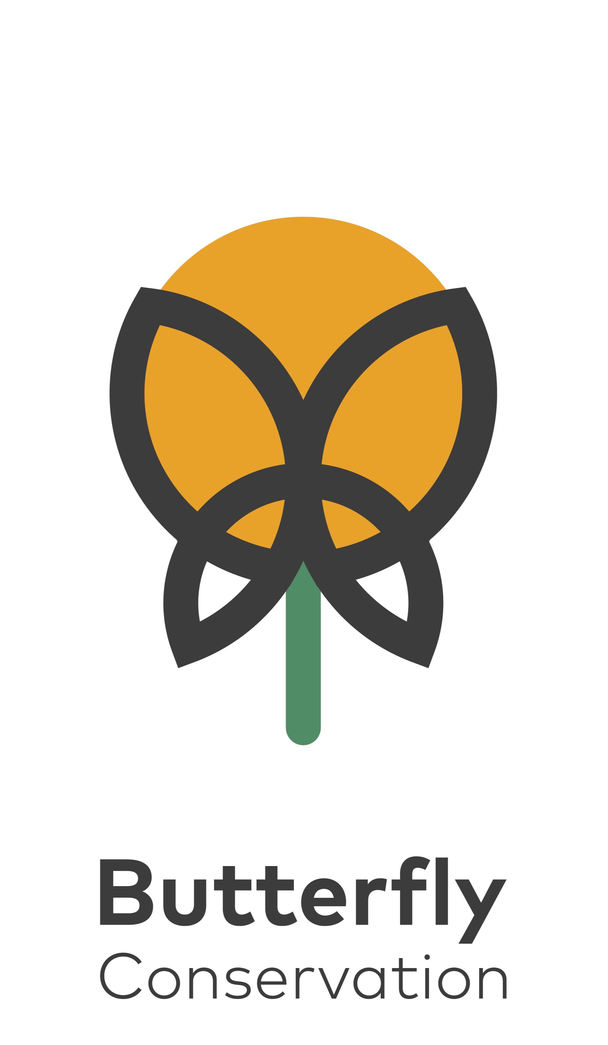
Final iteration
A review of branding touch points revealed that on sites, at talks, whilst directing ecological surveys and educational events, there was a lack of consistency (if at all) in the brand presence. We pointed to some options presented as a series of future investment levels, that could be expanded upon, so as to accommodate seasonally-limited cashflow.
Including vehicle liveries, volunteer apparel, event signage, promotional materials, branding equipment, etc.


Alignment
Now to harmonise with digital products, online touch points and build on the direction, ensuring a cohesion to the brand.
Initial investigation revealed there wasn’t a distinct target market or user group, no longer terms goals had been outlaid post shipping and no follow up research.
The app was currently leaning on a default templated Survey product.
Defining Objectives
We created a series of questions for in-person interviews with the customer market we wanted to validate. I conducted many interviews, orchestrated via an invite invitation in app. Based on our interactions with these users, it became clear that the ‘big butterfly count’ volunteers (a yearly nationwide survey conducted by volunteers to assess butterfly numbers across the nation) were largely responsibly-minded people broadly wanting to aid environmental issues. Rather than the amateur ecologists and butterfly enthusiasts that we expected.
Growth opportunity
We were surprised to find that our hypothesis were proved invalid and that refocussing efforts provided a growth opportunity to attract more consistent product users. Following further research aimed at drawing in users with broader app requirements. We conducted realigned research by reaching out on relevant nature and butterfly forums and groups. The updated target users seemed they would most likely use this app whilst out and about to identify and/or to document butterfly sightings.
An unforeseen dynamic was also discovered in the form of parents wanting to engage their kids in certain activities that involved being outside, learning about nature and partaking in activities that better serve and nurture our natural links.
We then pivoted from an app for conducting a yearly survey to an app for both the yearly survey and more broadly for identifying, reporting and logging butterfly and moth sightings.

I started by improving visual cohesion, implementing new brand elements and improving page flows and designs. As well as implementing elements from a reference I like to hark back to: www.lawsofUX.com, which is a great reminder of a lot of relevant principals, law’s and processes to ensure I’m reaching a higher standard of implementation.
We conducted further research around compatible products in the ecology space, birdwatching apps, identification apps, sighting apps, etc. Based on personal experience as an amateur birdwatcher, I am familiar with the popularity of keeping a ‘life list’ (an ongoing list of all species seen). We prototyped an additional element on the information screens to add the species to a life list. With an associated area with the list of added species. To better facilitate year-round/ongoing app engagement.


Wireframing the major amends to user journeys, followed by user testing with rapid prototyping.
I assisted to develop realigned messaging funnels and identified potential improvements to user journeys and onboarding messaging considering the new shifted app design and user focus.

Addition of dark mode to complement users preferences and further increase retention via visual cohesion.

Outcomes
This is still a work in progress being developed currently with limited user Betas - the feedback from the board members, users and project leads based on app metrics and usage have all pointed towards great initial success, whilst providing huge foundations for continued improvement in a relatively niche space.